18 Oct Three Cardinal Laws in Effective Website Design
Three Cardinal Laws in Effective Website Design
Follow these straightforward and information-packed guidelines for an unsurpassable head start on your web layout. Your boss (or client) will praise you for your precedence, simplicity and speedy navigation!
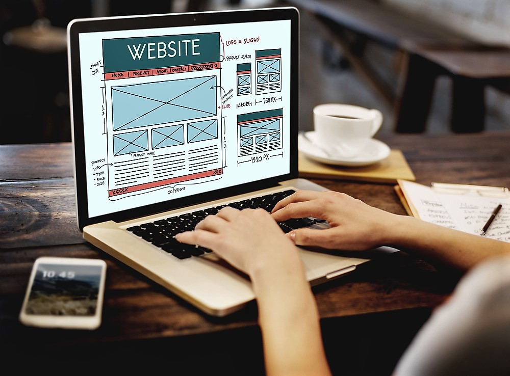
Guiding the Eye
A website’s general purpose is to display and outsource information to viewers about a product or a company. Unless you are looking for fun, viewers usually have a good idea about what they’re looking for when entering a site- and become disenchanted very quickly if they cannot find it within the first 30 seconds. Visual aesthetics should implement a website design’s flow and lead the viewer’s eyes throughout the screen. Overall, the screen needs to guide the viewer through the information, most likely in order from most important to least. Here are some important factors to keep in mind when designing your aesthetic layout.
- Positioning is key. The location of a blurb or textbox on a page influences the viewer entirely. Make sure the boldest, brightest piece of content is the one you want your clients to see (and to read!) first. Preferably, arrange your content boxes into a flowing order that exemplifies the most essential information first, followed by additional important content. (These boxes must contain top notch content to sustain your reader’s interest!)
- Color is basically a stoplight indication of where to look. Bright and bold colors scream for attention, while subtle hues are on your viewer’s backburner.
- If you haven’t considered the importance of typography, now is the time to do so. Similar to color, contrasting and bolding certain words makes your content stand out. If all the text and titles are the same, nothing looks like it deserves to be read first. In addition, font choices should align with the web page’s overall goal. Professional websites should host a savvy, modern font.
- The aesthetic spacing of your page needs to be considered. Spacing allows for simplistic clarity- which is a good thing! Don’t feel like you have to fill up your page with text! Crowded pages appear stressful and are typically avoided by viewers. Empty space or “white space” on your page is actually an extremely effective tool to balance and proportion your website. Empty space doesn’t have to be white, however, clean white blank alludes professionalism, elegance, and simplicity.
User-Friendly
Examine your target market for your webpage and adhere to their necessities. Or, as a general rule of thumb, create your website to be usable for all! Confusing call to action buttons, inconsistencies, small font, or hiding text can be extremely confusing to some viewers and could result in them leaving your site out of frustration. Clarity, simplicity, and correct utilities are absolutely imperative.
- Your page has to be self-explanatory. If it’s too dated or even too modern, it could be an easy dismissal from your client all because they don’t know where to look. Don’t leave people guessing! There is zero chance a client or potential customer will continue with their interest in your business if they do not know how to navigate the website. Clear structure, appropriate and essential visual clues, and universal vernacular are a shoe-in for optimal viewer comprehension.
- Simplicity is a timeless element for a reason. For initial website set-up, keeping it simple is always the way to go. However, that doesn’t mean your website should be bland and lacking sufficient information- it refers to the removal of excess content clutter. Avoid long, entangling titles and detailed paragraphs on your main page. Your homepage should be alluring, aesthetically pleasing, and cut to the chase with your most important information. Don’t run out your user’s patience!
- Effective writing techniques can sway interest as well. If this website is for your business, it’s important that you talk business. Use concise, to-the-point phrases that are quick to read but are also appropriately informative. Your content doesn’t need to sound fluffy or like an advertisement- the use of objective and direct information about your service can be extremely effective if designed properly. For an organized layout, categorize your services and use varied heading fonts to indicate website direction.
Navigation and Testing
What goes hand in hand with having a user-friendly website is having an easily-navigable one. Most likely, users will not spend more than 15 seconds trying to find a certain category or service, and will leave your website frustrated and disenchanted with your business before they even know who you are. To keep viewers engaged, make sure your site’s speed and direction is up to date by checking up on your site’s navigational efficiency regularly!
- Organize your company’s services into clear categories at the top of your page. It’s recommended to keep a scroll-down option with subcategories so your header doesn’t appear crowded and confusing to new visitors.
- Make sure your call-to-action buttons lead where they’re supposed to lead! Nothing is more unprofessional than having misleading links on your business’s website.
- To establish a presence in your viewer’s mind, include your contact information on the front page of your website, and strategically incorporate it throughout your service pages. At the very least, your business should have a fax, telephone and email contact readily available.
- Website efficiency is nothing without speed! According to Compuware, the average time people will wait for a website to load has decreased from 8 seconds to 3 seconds… which means if your wireless speed isn’t up to date, your company is at risk for losing its relevancy. If your site takes more than 3 seconds to load, try de-cluttering your homepage. If that doesn’t work, it’s way past time to upgrade your servers.
- Lastly, it’s imperative to test your website efficiency, and test early. If you’re just starting out, testing early provides you with clear indications of what needs more attention before your website goes viral- and before you’ve produced content that may not work. Consistent checkups and efficiency evaluations will ensure that your page is in top-notch condition and save you from negative feedback stress.
Sorry, the comment form is closed at this time.